Delivering a New User Experience
Improving the Deliveroo Rider application to make collections from 140,000 restaurant partners quicker and more streamlined.
Online
Mobile & Web
UX Design
2024
The Problem Area
Deliveroo, a leading food delivery platform, recognized the need to optimize their rider application to enhance efficiency and user experience.
With a vast network of 140,000 restaurant partners, the company aimed to streamline the collection process for riders, reducing wait times and improving overall service quality.
A Real-Life Scenario
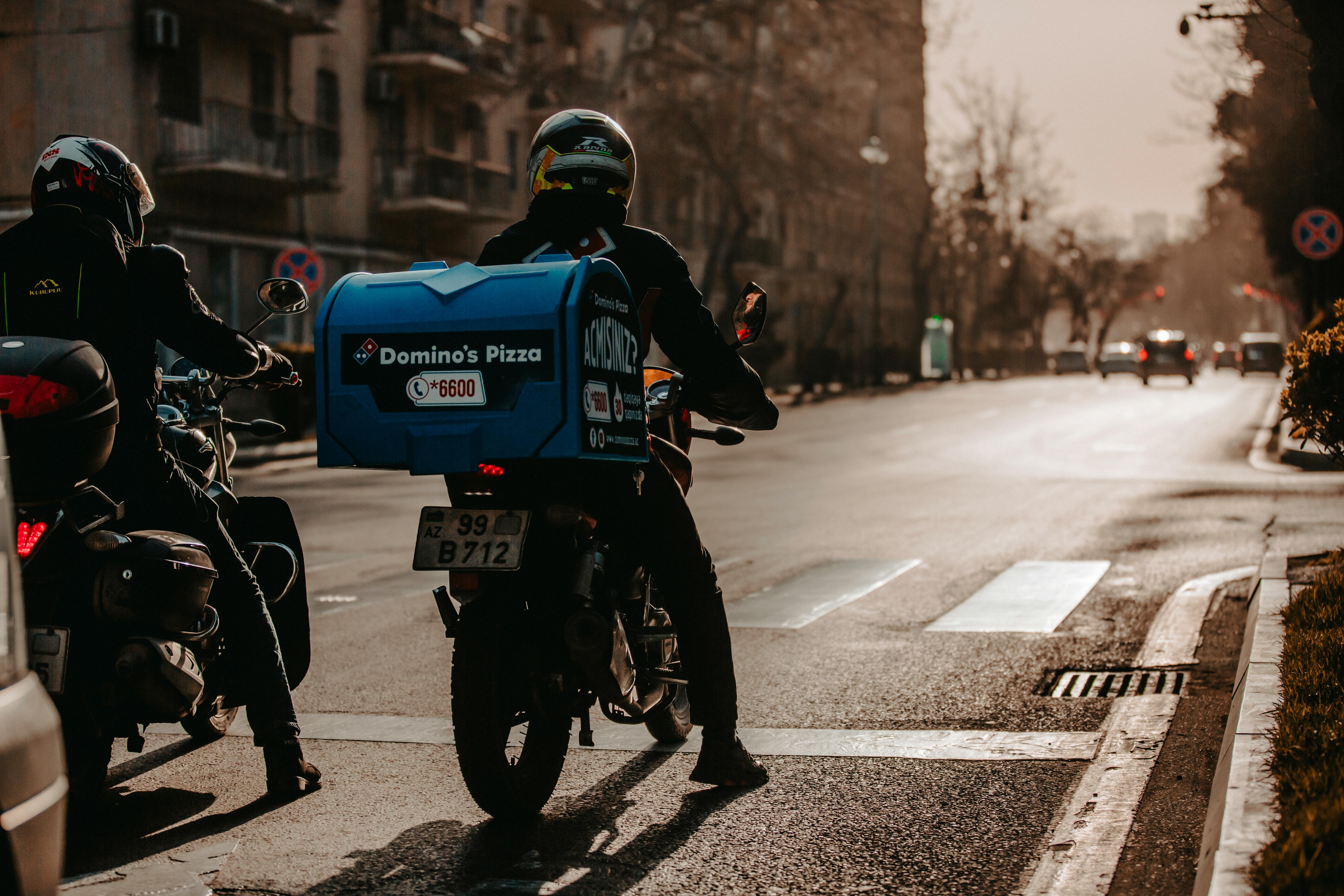
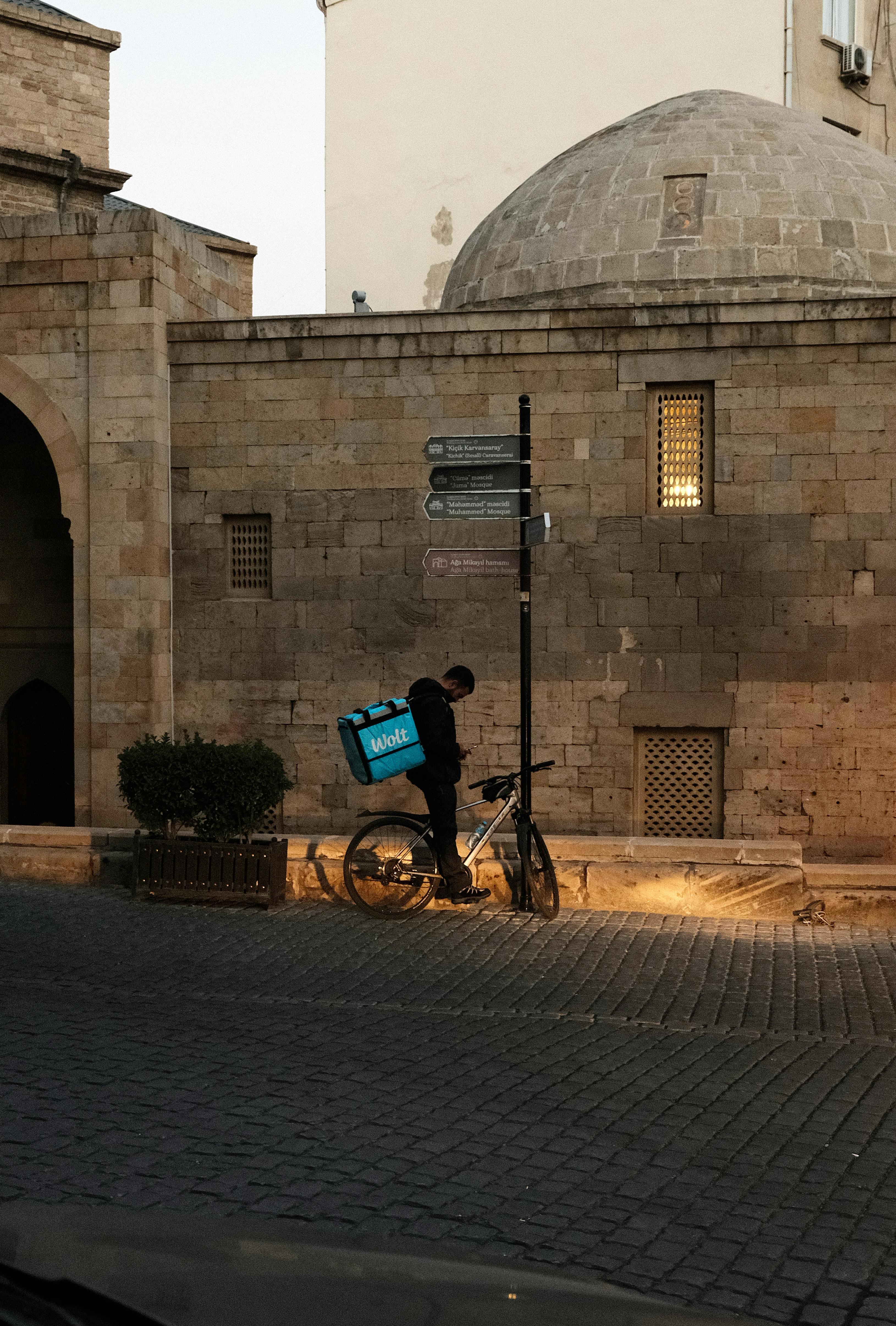
Riders often faced challenges navigating through the app to find essential information about their pickups, leading to delays and frustration.
This inefficiency impacted not only the riders but also restaurant partners and end customers, creating a ripple effect on the entire delivery ecosystem.
Prioritising Core Areas of Focus
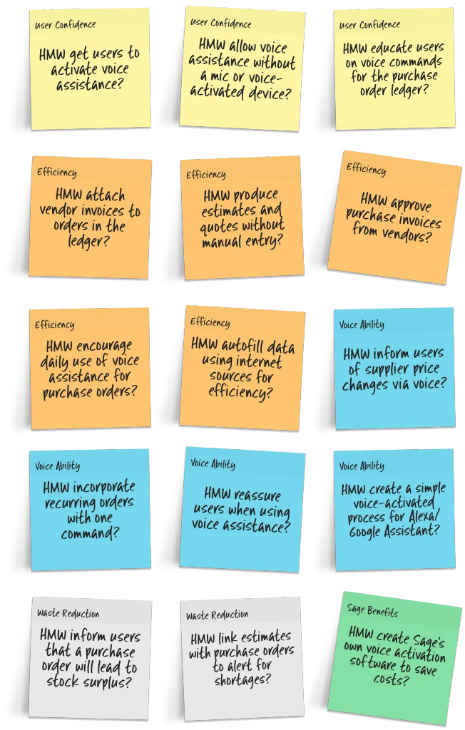
Using a 'Dot Voting' process, we identified key areas for improvement through 'How Might We' (HMW) statements.
Core focus areas included:
Enhancing pickup efficiency
Improving route optimization
Simplifying order information access
Integrating real-time communication features
Goal Setting
We established short-term 'Scope Goals' for a 4-week sprint and long-term objectives for the next 18 months.
Short-term goals included redesigning the order acceptance flow and implementing a new navigation system. Long-term goals envisioned a fully integrated, AI-powered rider assistant to optimize routes and predict potential issues.
Design Sprint Preparation
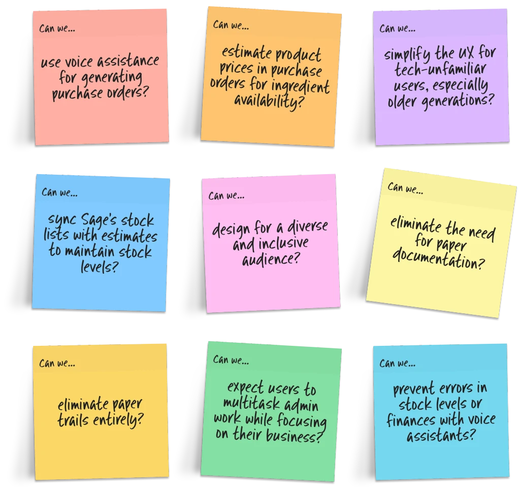
We formulated critical questions to guide our design sprint, and addressing concerns.
The main questions that arose were:
How might we reduce wait times at restaurants?
Can we improve the accuracy of estimated pickup times?
How can we better support riders during peak hours?
Ideation and Concepts
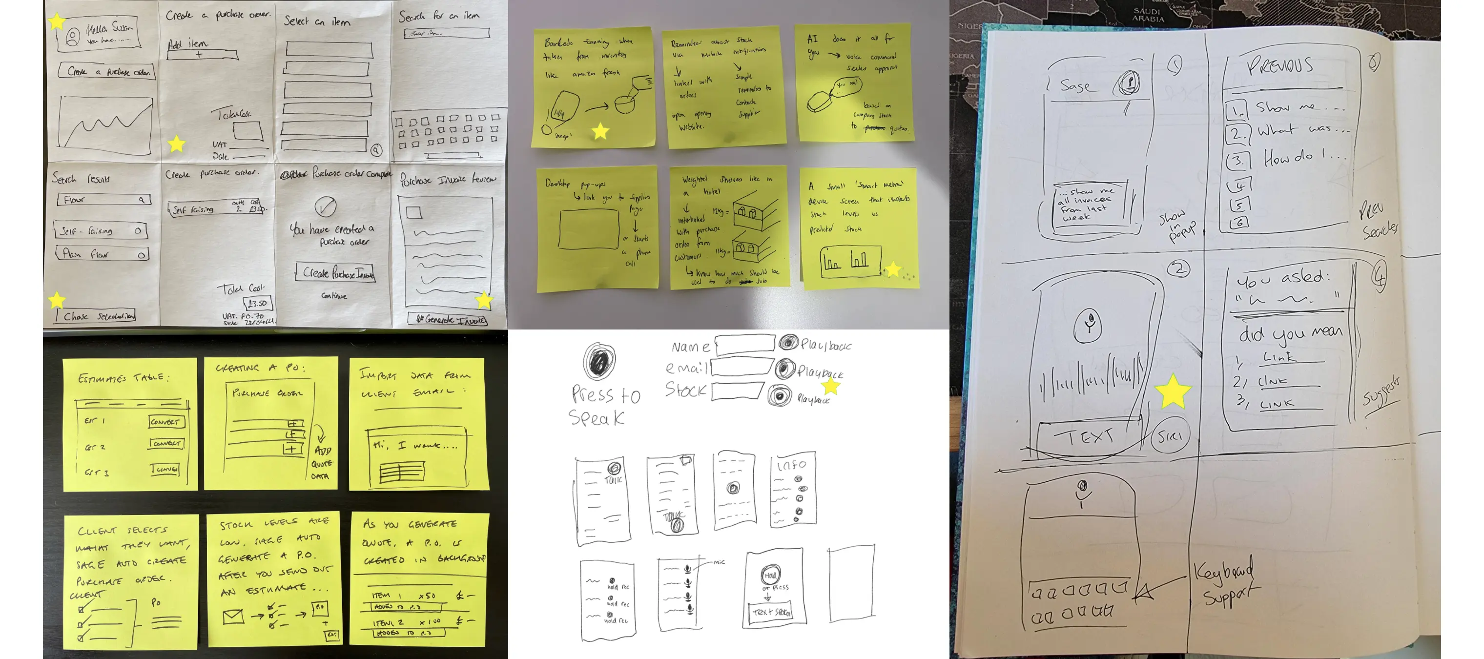
Rapid ideation sessions, including Crazy 8's exercises, generated innovative ideas for UI improvements.
New features ideas consisted of:
A voice-activated hands-free mode for safer navigation
Real-time restaurant busy-ness indicators
Smart order stacking for efficient multi-order pickups
Mapping the Storyboard
We created detailed storyboards to visualize the rider's journey, from receiving an order to successful delivery.
This process helped us identify pain points and opportunities for improvement throughout the entire experience.
Competitor Analysis
We analyzed competitor apps like Uber Eats and DoorDash to benchmark features and identify potential areas for innovation.
This analysis informed our approach to developing unique features for Deliveroo's rider app.
Competitors


Preview Any Invoices


Create & Manage Clients


Customise & Populate Invoice


Invoice Language Change


Graphical Data for Finances


In-Built Time Tracking


Onboarding for New Users


Prototyping and Ideation
We developed a series of prototypes, starting with low-fidelity wireframes and progressing to high-fidelity mockups.
These prototypes focused on key features such as:
A redesigned order acceptance screen
An improved map interface with clearer pickup and dropoff indicators
A new communication hub for direct contact with customers and support
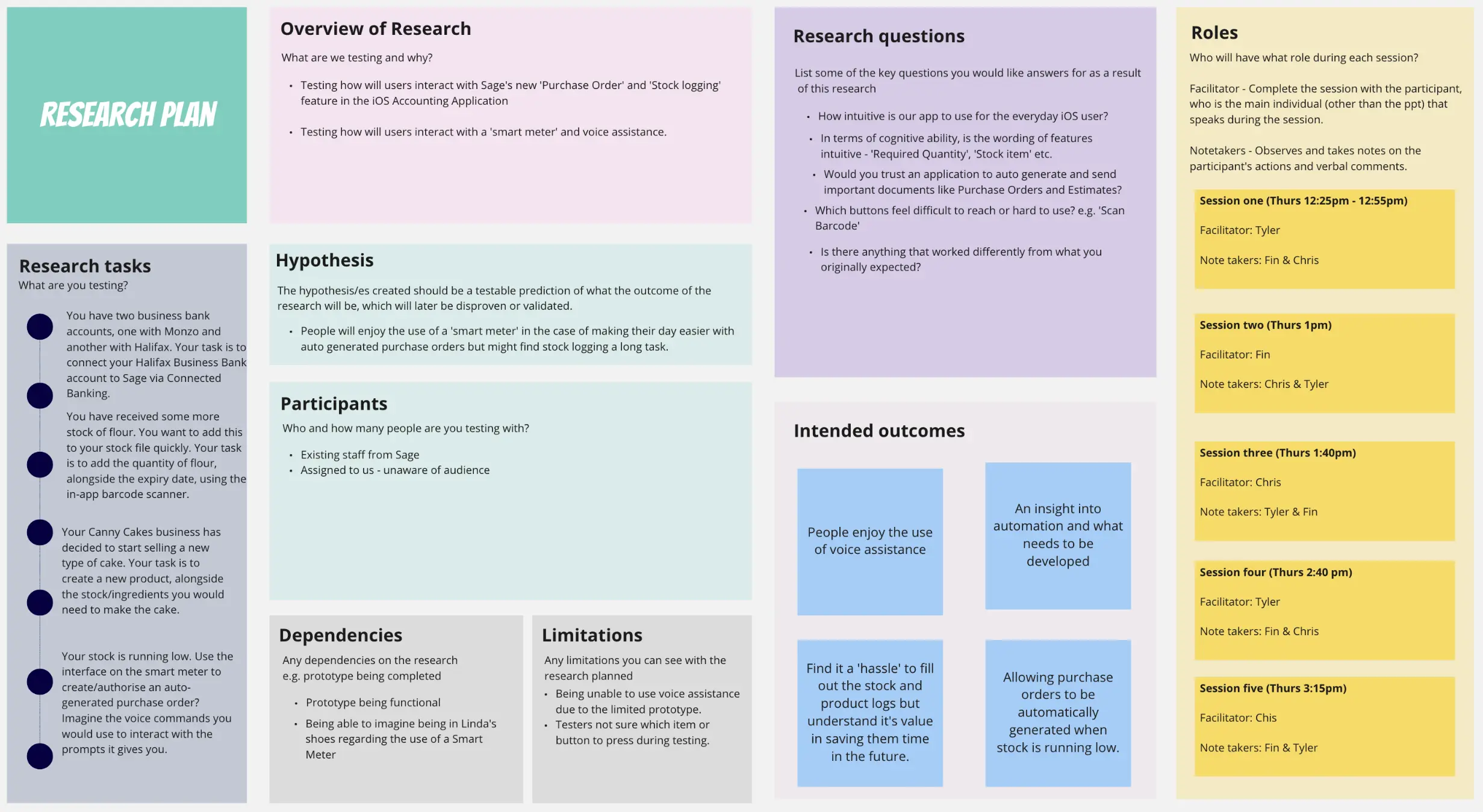
User Research and Testing
We conducted extensive user testing sessions with current Deliveroo riders, gathering feedback on our prototypes.
Feedback was categorized into 'Positive', 'Needs Improvement', and 'New Ideas', helping us refine our designs iteratively.
Mobile Application
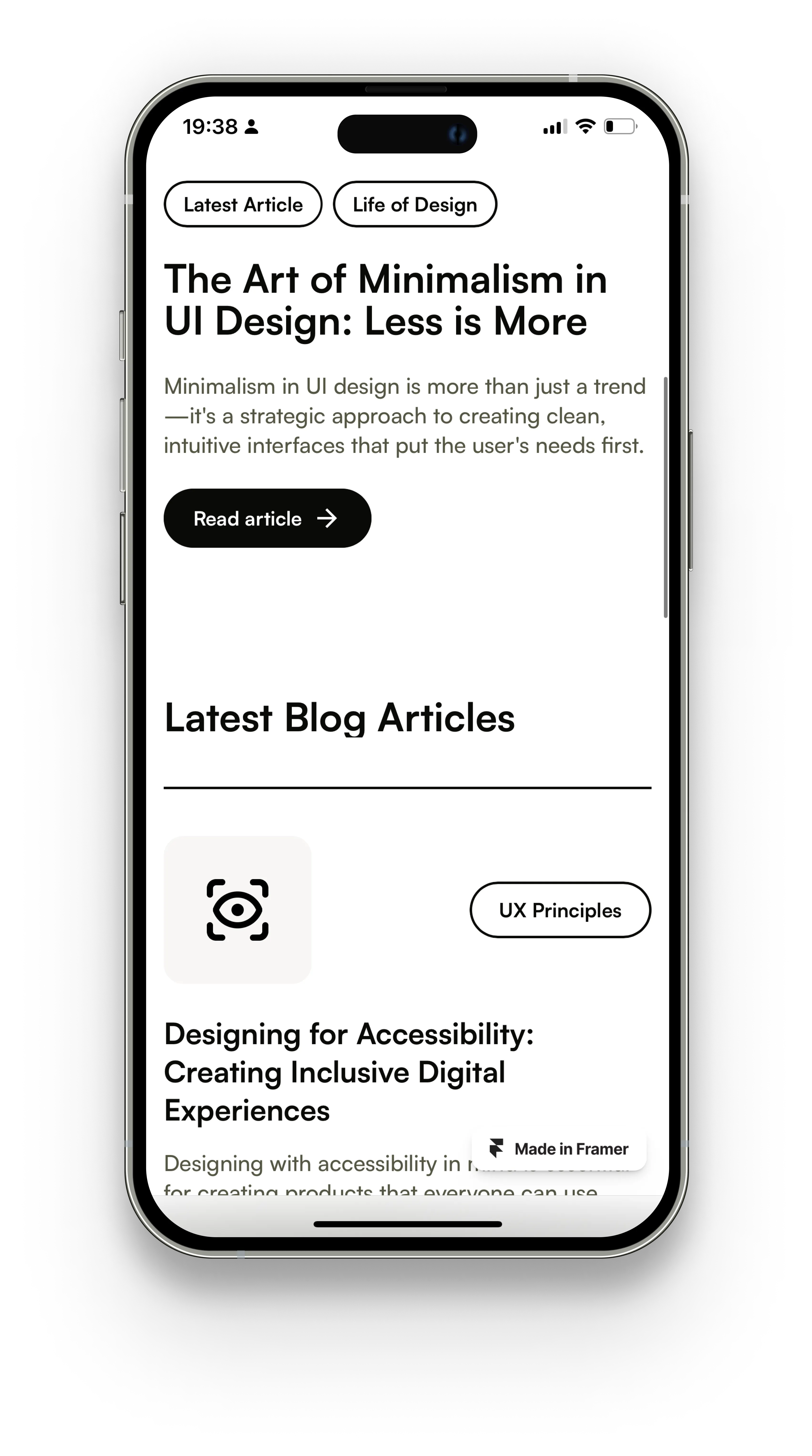
The final app designs introduced innovative features. Users can now utilise voice assistance for stock management, simplifying inventory tracking.
Additionally, a redesigned purchase order system optimised the procurement processes. These improvements were accompanied by a centralised dashboard, providing users with real-time insights and intuitive navigation.
Home Dashboard
A redesigned home screen providing at-a-glance information on earnings, available orders, and performance metrics.

Smart Route Optimization
An AI-powered system suggesting the most efficient routes for multi-order pickups and deliveries.


Restaurant Interface
A new screen displaying real-time information about restaurant wait times, parking availability, and specific pickup instructions.


Rider Community Hub
A platform for riders to share tips, report issues, and access support resources.


Deliveroo Rider Assist
We conceptualized a voice-activated Rider Assistant to provide hands-free guidance and support during deliveries.
These new features included:
Voice Navigation
Turn-by-turn voice directions optimized for cyclists and scooter riders.

Order Management
Verbal confirmations for order pickups and deliveries, reducing the need to interact with the phone while in transit.
Real-Time Updates
Automatic voice notifications about order changes, traffic updates, and earning opportunities.
The Impact
The redesigned Deliveroo Rider application significantly improved the efficiency of food pickups and deliveries. Early testing showed a 20% reduction in average wait times at restaurants and a 15% increase in rider satisfaction.
These improvements not only enhanced the rider experience but also contributed to faster delivery times and increased customer satisfaction, solidifying Deliveroo's position as a leader in the food delivery market.
